
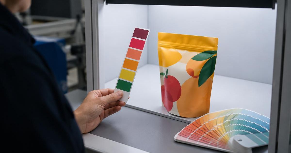
The color on your approved PDF and the color on your finished pouch will never be identical, and that is normal. What matters is agreeing in advance on how close is close enough, which colors are critical, and what kind of proof represents the final result. A clear packaging color proofing process prevents the most expensive kind of misunderstanding: discovering after a full run that the brand color looks wrong on the shelf.
This article explains the proof types you are likely to see, why flexible packaging behaves differently from paper, and how to review and approve a proof with confidence.
Why Color on Flexible Packaging Is Harder Than It Looks
Several factors shift printed color on flexible materials:
- Substrate. Clear, white, and metallized films reflect light differently. The same ink can look brighter on white film and darker or cooler on metallized film.
- White ink underlay. On clear or metallized structures, graphics are often printed over white. The opacity of that white changes how vivid colors appear.
- Lamination. Many pouches are reverse-printed on an outer film and laminated to an inner layer. The adhesive and second film can slightly alter appearance.
- Finish. Matte and gloss surfaces change perceived saturation and contrast.
- Process. Digital, flexographic, and rotogravure printing each have different color gamuts and repeatability characteristics. Our comparison of digital and traditional printing for flexible packaging covers those differences.
Because of these variables, a proof is only meaningful if everyone knows what it represents.
Types of Packaging Proofs
PDF or Soft Proof
A soft proof is a digital file reviewed on screen. It is the right tool for checking content, layout, copy, barcodes, and dieline placement. It is not reliable for judging final color, because monitors vary and are rarely calibrated to the print condition.
Contract or Color Proof
A contract proof is printed on a calibrated proofing system intended to simulate the final printing condition. It is useful for agreeing on color intent, but it is usually printed on paper or proofing stock rather than your actual film, so it cannot show the effect of metallized substrates, white ink opacity, or lamination.
Printed Sample or Press Proof
A sample printed on the production process and, ideally, the actual film structure is the closest preview of the final pouch. It costs more time and money, but for a new brand, a new structure, or a color-critical product, it often pays for itself. With digital presses, printed samples are generally more practical than with plate- or cylinder-based processes, which require tooling before anything prints.
Physical Pouch Prototype
A converted prototype adds the physical package: you can check how graphics wrap gussets, sit around zippers, and look when filled. This is especially useful for stand-up pouches and new formats.
Define Color Standards Before the First Proof
The single most useful step is writing down which colors matter and how they will be judged.
- Identify critical colors. Usually one or two brand colors, not every hue in a photo.
- Name a reference. A specific Pantone number, a previously printed and approved package, or a physical brand standard. A screenshot is not a reference.
- Agree on lighting. Color judged under warm office light will look different under daylight or store lighting. Many printers evaluate under standardized viewing conditions; ask which your supplier uses and view proofs under the same conditions when possible.
- Discuss tolerance. Printers often measure color numerically, such as with Delta E values. Ask how your supplier measures and communicates variation instead of assuming a number. Industry calibration methods such as Idealliance G7 are one way printers align output across devices; ask what process your supplier follows.
Spot colors that fall outside the printing gamut may be simulated rather than matched exactly. Ask early whether your brand color is achievable on the chosen process and substrate.
How to Review a Packaging Proof
Review in two passes: content first, color second.
Content Pass
- Confirm every SKU name, flavor, size, net quantity, and claim against your master copy.
- Check ingredients, allergen statements, nutrition or supplement facts, and required company information.
- Confirm barcodes match the correct SKU.
- Check placement against seals, zipper, tear notch, gusset folds, and windows.
- Verify version numbers so you are approving the latest file.
Color Pass
- View under consistent, appropriate lighting.
- Compare critical colors against your physical reference, not your screen.
- Look at skin tones, food photography, and neutrals, which reveal color casts quickly.
- Check small text and fine lines for sharpness and registration.
- On clear or metallized films, check whether white ink coverage and window areas are correct.
Mark comments directly and specifically, for example "brand red slightly orange compared with approved 2025 pouch," rather than "color looks off."
Who Should Approve
Limit final approval to a small, defined group: typically a brand or marketing lead for color and design, a regulatory or quality person for required copy, and an operations contact for format and equipment details. Too many reviewers lead to conflicting notes; too few lead to missed errors. Approve in writing, and keep a record of exactly which proof version was approved.
When to Request a Printed Sample
A printed sample on the production process is worth considering when:
- You are launching a new brand or major redesign.
- Brand color consistency is central to recognition.
- You are moving to a new substrate, such as from white film to metallized or clear.
- You are switching suppliers or printing processes.
- Photography or food imagery drives purchase decisions.
For a reprint with no changes on the same structure and process, a soft proof for content plus comparison against the last approved run is often sufficient.
Keeping Color Consistent Across Reorders and SKUs
Consistency over time is as important as the first approval. Keep approved retained samples from each run. When ordering again, tell your supplier which past run is the target. For product lines, review several SKUs side by side, because shoppers see them next to each other on the shelf. Shorter, more frequent runs, discussed in our packaging MOQ guide, make it easier to correct artwork between orders, but they also make a documented color standard more important.
Common Proofing Mistakes
- Approving color from a phone or uncalibrated monitor.
- Expecting a paper contract proof to show metallized or clear-film effects.
- Making design changes after color approval without a new proof.
- Approving one SKU and assuming the others match.
- Leaving tolerance and reference undefined until there is a disagreement.
Start Your Next Run With Clear Expectations
Good proofing is a shared agreement, not a formality. Before your next order, prepare your critical color references, past approved samples, and the list of approvers. Make sure your files are production-ready using our flexible packaging artwork preparation guide, then talk with our team about the proof type that fits your launch or reprint. You can also see how we approach production on our process page.