
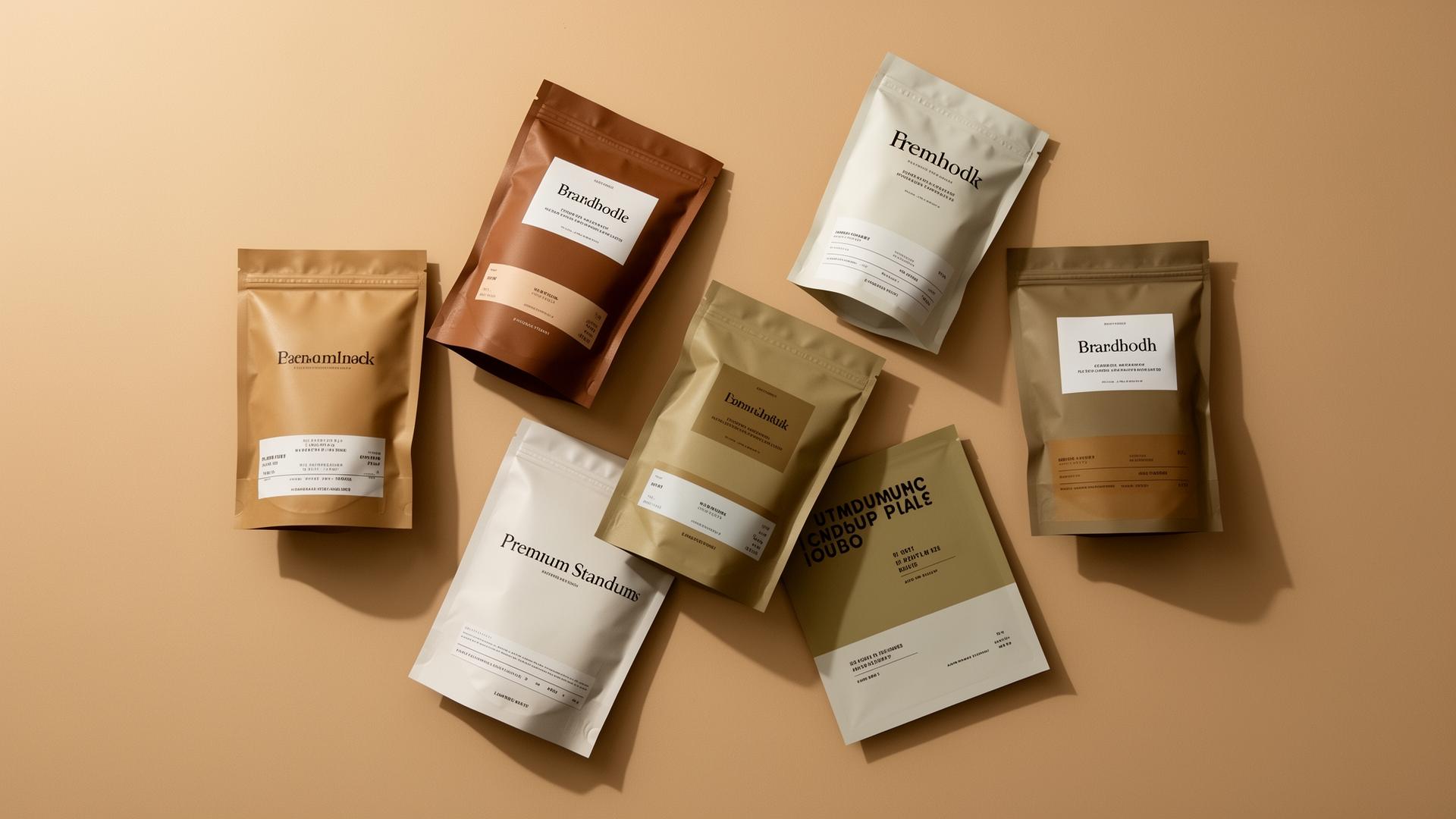
A shopper walking a category gives most products a fraction of a second. Packaging is what has to survive that moment. It is also the only piece of marketing that a customer holds, opens, stores in a cupboard and looks at again every time they use the product.
That is why pouch design gets treated as a sales lever rather than a cost line. The question is which parts of it actually influence purchase.
Visibility comes before persuasion
Nothing on a package works if the package is not seen. A stand-up pouch presents a flat, upright face at eye level, and that face is the billboard. Flat-bottom and quad-seal bags stand more rigidly and hold their shape when partially empty, which keeps the face square through the life of the facing.
Contrast is the mechanic that drives visibility. Against a shelf of similar categories, the products that stand out generally do so through a decisive color field and clear separation between elements — not through more detail. Detail is legible at arm's length; contrast is legible from the aisle.
Hierarchy: three things, in order
A shopper resolves brand, then category, then variety. If those three compete visually, none of them lands, and the product reads as generic.
Practical approach: one dominant brand element, one unmistakable category statement (what the product is, in plain words), and one variety identifier that differs strongly between SKUs. Flavor differentiation by subtle shade shifts fails at shelf distance and, worse, causes pick errors and returns.
Material and finish do measurable work on perceived value
Finish is the highest-leverage decision per dollar in pouch design.
Matte laminations read as considered and premium and reduce glare in bright retail lighting. Soft-touch adds a tactile quality that a shopper registers the moment they pick the pack up, which is exactly the moment a purchase decision is often made. Spot gloss over a matte field creates emphasis without adding a color. Metallized substrates give a genuine metallic effect that printed silver ink cannot reproduce. Kraft laminates carry a natural, minimally-processed cue that suits some categories and undercuts others.
None of these change the product inside. All of them change what a shopper expects the product inside to be worth.
Functional features that drive repeat purchase
First purchase is design. Second purchase is experience.
A press-to-close zipper keeps a multi-serve product usable and keeps the pack visible on a counter or in a pantry rather than sealed in a clip or transferred to a container. A tear notch means the pack opens cleanly instead of being attacked with scissors. A degassing valve on fresh-roasted coffee protects the flavor the customer paid for. A window shows product where seeing it builds confidence — nuts, granola, pasta, pet treats.
These are specification decisions made before printing, and they influence reorder rate more than the graphics do.
Protection is a sales feature
A pouch that fails — stale product, a leaked seal, a burst in transit — costs the customer and the review. Barrier selection is therefore a marketing decision as much as a technical one: metallized or foil structures for oxygen-sensitive products, moisture barrier for anything crisp, and light barrier for pigments and oils.
A product that tastes right on the last serving is what produces a second purchase.
Digital printing turns design into something you can test
The strategic argument for digital printing is not just cost. It is iteration.
Without plate or cylinder tooling, running several designs in one order costs roughly the same per unit as running one. That makes real testing affordable: two front-panel treatments in different accounts, a limited seasonal edition, a retailer-specific pack, a claim update the week it clears review.
Brands that can revise packaging in weeks rather than quarters compound small improvements. Brands locked into engraved cylinders live with last year's design until the inventory runs out.
Variable and short-run capability also unlocks limited editions and collaborations, which generate attention that a static pack cannot.
What to avoid
Low-resolution hero photography enlarged to a full panel. Type set for a screen rather than a shelf. Copy or logos placed where the bottom gusset folds under. Color approved on a monitor and not on a physical proof — matte lamination in particular mutes saturated colors noticeably. Ten SKUs that differ only by a small colored band.
Where to start
If your current pouch is underperforming, look at it from six feet away in ordinary store lighting alongside the competition. Most problems are visible from there: it disappears into the set, the variety is unreadable, or the finish makes it look cheaper than the product is.
If you want help specifying a pouch that fixes those, send your product details and current pack through our contact form.